Going to the Carnegie museum was an interesting learning experience. First I learned that people who lived hundreds of years ago were way better. They created mind-blowing things while working with much less: less exposure to new ideas, less access to materials, less freedom of expression, and less time. I took away the simple fact that I could be a better person, and should put forth more effort in everything I do. That was an idea for this class that was very general.
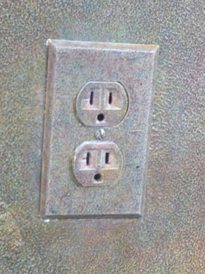
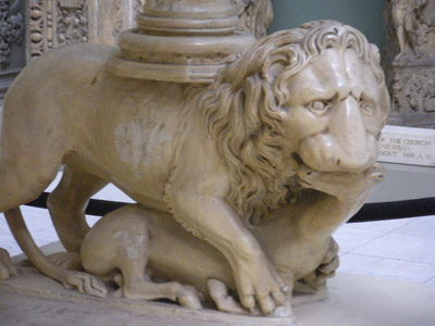
More specific ideas included this outlet I found on the wall. It is the same color as the wall (which was artwork itself) and blended in seamlessly. It was functional, as an outlet, yet also part of the painted wall. Websites could take a page out of this part of the museum. Creators of websites want them to be functional, but also appealing to the eye and blend in with the rest of the page. Lastly there was a gazebo with large white pillars surrounding it. At the bottom of these pillars were lions. These lions were devouring a horse. I think it would be nice to somehow implement this into my page. Maybe have the content surrounded by pillars with lions underneath who are also eating horses. Or a lion eating a lion eating a horse. I did not retain the name of the creator of this gazebo, just astonishment of the awesomeness presented by his/her craftsmanship.

MORE WRITING >
More specific ideas included this outlet I found on the wall. It is the same color as the wall (which was artwork itself) and blended in seamlessly. It was functional, as an outlet, yet also part of the painted wall. Websites could take a page out of this part of the museum. Creators of websites want them to be functional, but also appealing to the eye and blend in with the rest of the page.
 Lastly there was a gazebo with large white pillars surrounding it. At the bottom of these pillars were lions. These lions were devouring a horse. I think it would be nice to somehow implement this into my page. Maybe have the content surrounded by pillars with lions underneath who are also eating horses. Or a lion eating a lion eating a horse. I did not retain the name of the creator of this gazebo, just astonishment of the awesomeness presented by his/her craftsmanship.
